Zine
Зин-коллаж
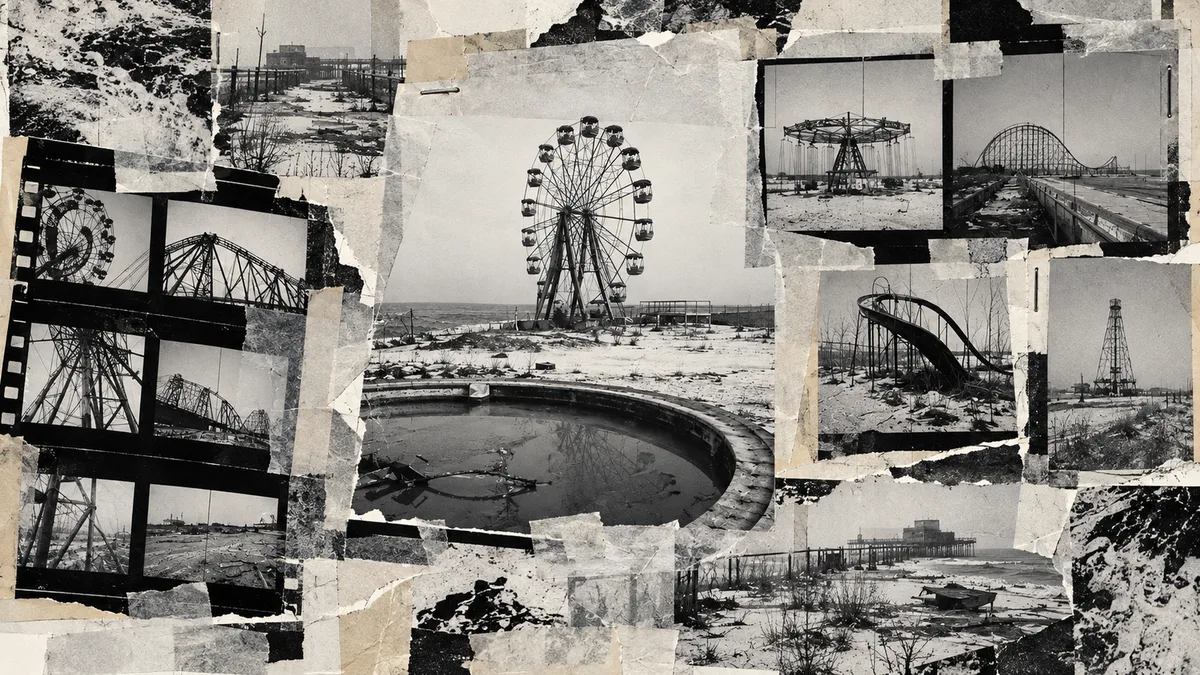

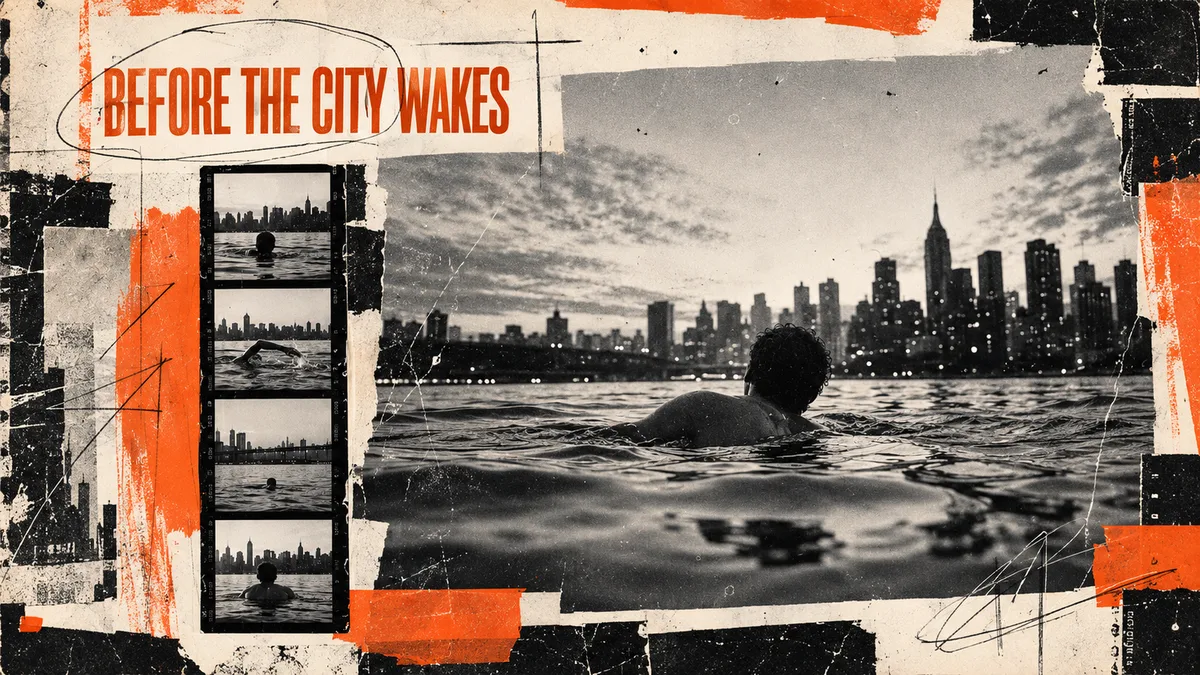
Экспериментальная эстетика независимого зина с фотографиями, ксероксом, рваной бумагой и рукописными пометками. Асимметричная сетка соединяет один главный кадр с небольшими документальными фрагментами. Подходит для редакционных разворотов, афиш и визуальных дневников.
Промпт
Create a [FORMAT] experimental independent zine spread about [SUBJECT]. Build the image as a tactile editorial collage: documentary photographs, extreme crops, contact-sheet fragments, photocopies, torn paper, handwritten marks, captions, page numbers and generous areas of raw paper. Use an asymmetric but intentional grid with overlapping elements, irregular margins and a strong hierarchy between one dominant image and several small supporting fragments. Palette: mostly black, off-white and grey, with one or two muted accent colors chosen from [COLOR ACCENTS]. Texture: scanner dust, photocopy noise, ink bleed, tape shadows, folded paper, imperfect registration and slightly warped pages. The mood is intimate, art-school, observational and culturally literate—not chaotic for its own sake. Exact title if needed: ""[TEXT]""; render it legibly as restrained editorial typography or hand lettering.
Avoid: polished magazine glamour, scrapbook clichés, cute stickers, perfectly clean mockup, random unreadable text, maximalist clutter without hierarchy, watermark.
Как использовать
1. Замените [SUBJECT] и при необходимости укажите 1–2 акцентных цвета в [COLOR ACCENTS].
2. Добавьте точное название через [TEXT] или удалите эту строку.
3. Сохраняйте один доминирующий кадр и несколько второстепенных фрагментов.
4. Проверьте читаемость заголовка и не допускайте случайного хаоса без иерархии.
Похожие приёмы
Bauhaus
Баухаус
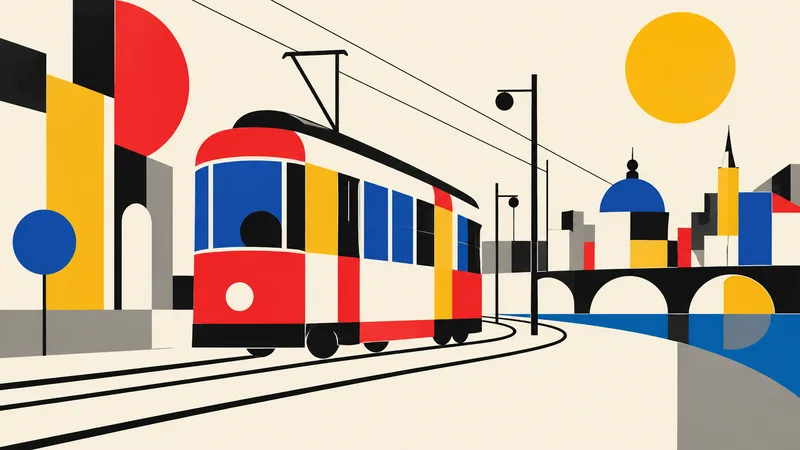
Translate the subject into a disciplined Bauhaus-inspired composition. Reduce it to fundamental geometric elements—circles, rectangles, semicircles, straight lines, and carefully measured overlaps—on an ivory or warm-white field. Use a strict but playful primary-color palette of red, cobalt blue, mustard yellow, black, and a small gray neutral. Establish clear alignment, purposeful asymmetry, and dynamic balance through scale and placement rather than decoration. If the subject is figurative, abstract its defining features into a few geometric relationships while retaining recognition; if it i
Brutalism
Брутализм
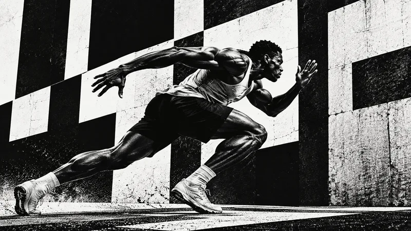
Design the subject as a confrontational brutalist poster. Use an uncompromising black-and-white palette, huge heavy sans-serif typography when exact text is supplied, raw high-contrast photo cutouts, coarse halftone or xerox grain, and strong rectangular blocks. Crop boldly, let elements run toward or beyond the frame edges, and embrace deliberate visual weight without decorative polish. One dominant subject or phrase should be immediately legible across a wide 16:9 canvas, supported by smaller restrained details. Use rough print imperfections and hard light to intensify the mood. The result s
Anti-design
Антидизайн
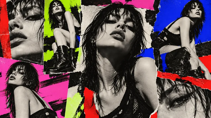
Treat the subject as an intentional anti-design experiment. Reject a neat corporate grid: mix drastically different crop sizes, clashing type scales, abrasive color combinations, abrupt borders, overlapping photo fragments, raw screenshots or print textures, and visual collisions that feel audacious but authored. Use a high-impact palette such as black, red, lime, pink, cobalt, and off-white. Arrange several panels or zones across the 16:9 canvas so the viewer notices dissonance, yet guide attention back to one primary subject or message. If text is required, use only a few exact short words a