Swiss Design
Швейцарский дизайн
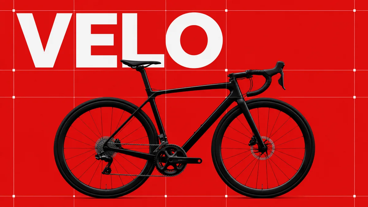
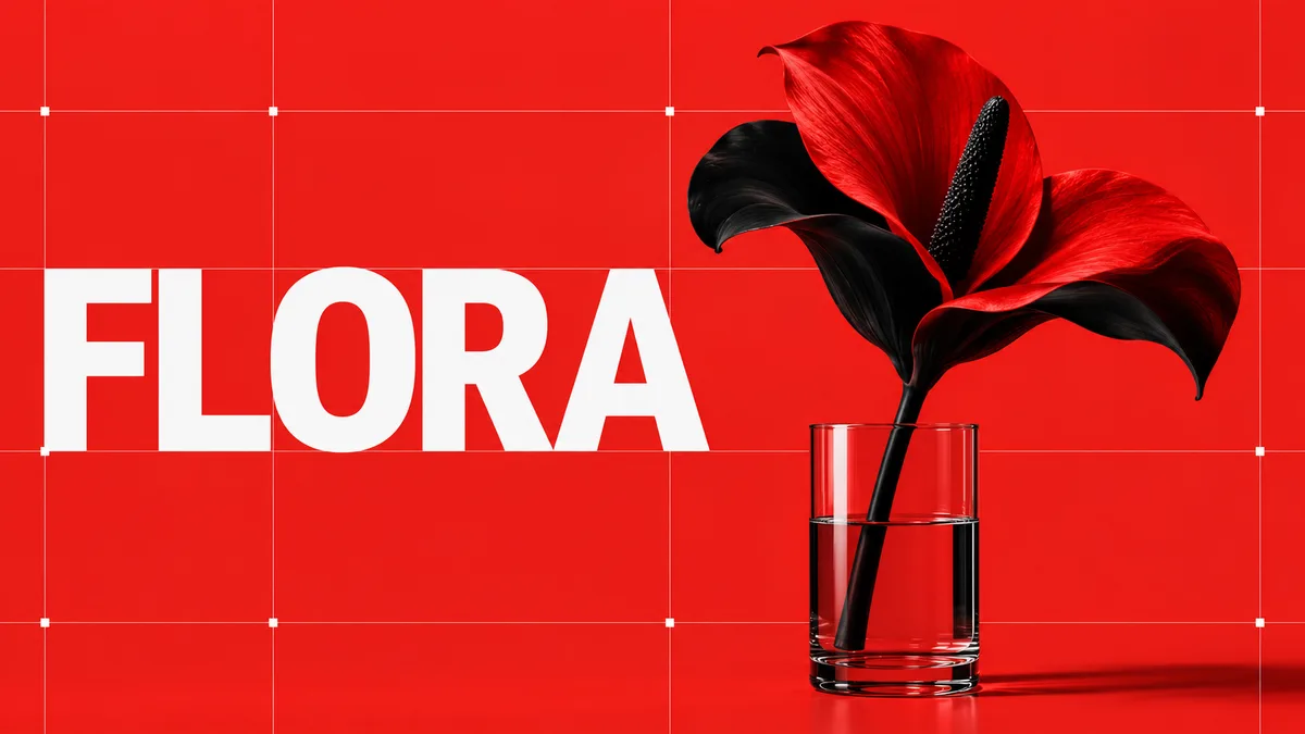
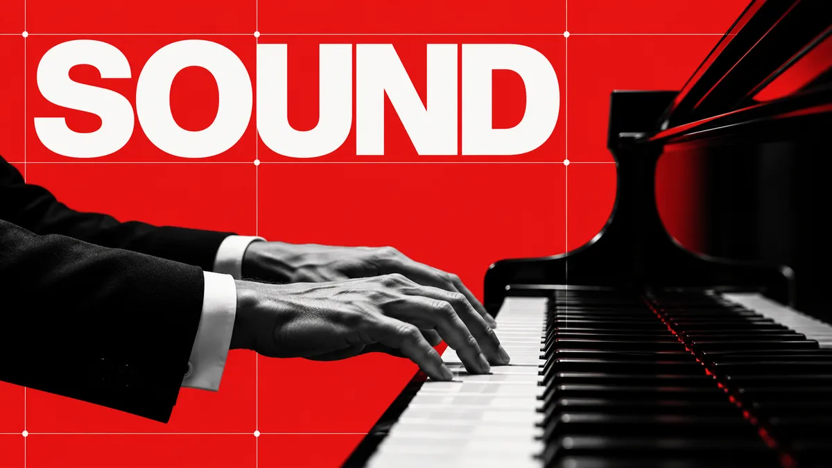
Строгая модернистская композиция на модульной сетке. Красный фон, чёрный объект, белая гротескная типографика и точные выравнивания формируют ясную визуальную систему.
Промпт
Recompose the subject using classic Swiss International Typographic Style. Establish a rigorous modular grid, exact alignment, strong hierarchy, and generous measured spacing. Use a vivid red field with black imagery and crisp white sans-serif typography or geometric placeholders. Reduce the main subject to one bold, high-contrast photograph, cutout, or abstract form and position it precisely within the grid. Add subtle grid marks, registration-like points, and small rational labels only if text is requested. Let the composition feel objective, structured, modernist, and confident. Avoid decorative flourishes, distressed collage, random rotations, and excessive colors.
Как использовать
Опишите нужного героя, предмет или сцену и добавьте английский промпт стиля в конец запроса. Если используете исходное фото, попросите сохранить личность, позу и важные детали. Для текста задайте короткую точную надпись; если текст не нужен, запретите буквы, цифры и логотипы.
Похожие приёмы
Bauhaus
Баухаус
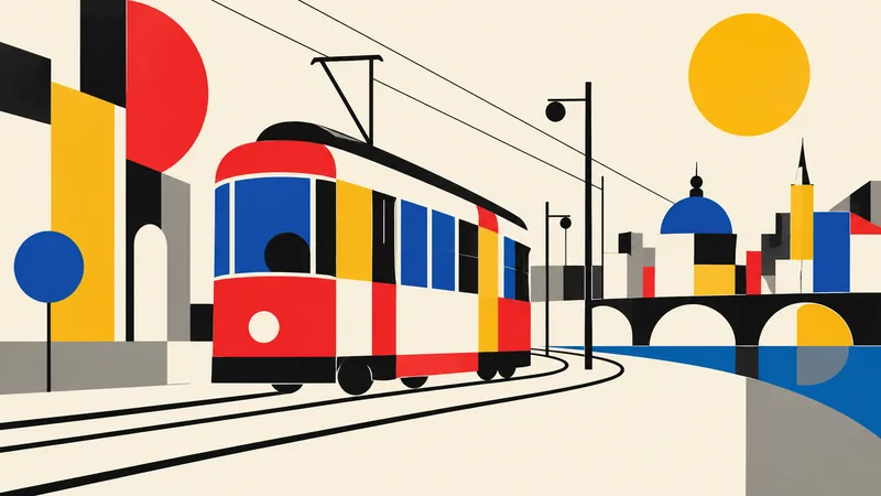
Translate the subject into a disciplined Bauhaus-inspired composition. Reduce it to fundamental geometric elements—circles, rectangles, semicircles, straight lines, and carefully measured overlaps—on an ivory or warm-white field. Use a strict but playful primary-color palette of red, cobalt blue, mustard yellow, black, and a small gray neutral. Establish clear alignment, purposeful asymmetry, and dynamic balance through scale and placement rather than decoration. If the subject is figurative, abstract its defining features into a few geometric relationships while retaining recognition; if it i
Brutalism
Брутализм
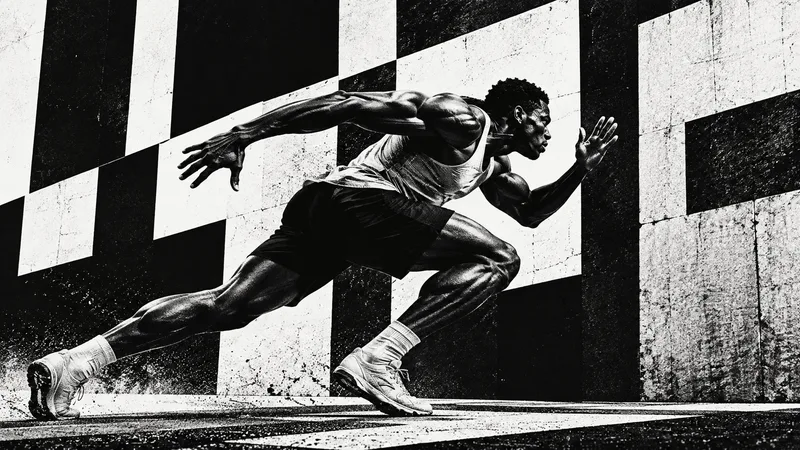
Design the subject as a confrontational brutalist poster. Use an uncompromising black-and-white palette, huge heavy sans-serif typography when exact text is supplied, raw high-contrast photo cutouts, coarse halftone or xerox grain, and strong rectangular blocks. Crop boldly, let elements run toward or beyond the frame edges, and embrace deliberate visual weight without decorative polish. One dominant subject or phrase should be immediately legible across a wide 16:9 canvas, supported by smaller restrained details. Use rough print imperfections and hard light to intensify the mood. The result s

Anti-design
Антидизайн
Treat the subject as an intentional anti-design experiment. Reject a neat corporate grid: mix drastically different crop sizes, clashing type scales, abrasive color combinations, abrupt borders, overlapping photo fragments, raw screenshots or print textures, and visual collisions that feel audacious but authored. Use a high-impact palette such as black, red, lime, pink, cobalt, and off-white. Arrange several panels or zones across the 16:9 canvas so the viewer notices dissonance, yet guide attention back to one primary subject or message. If text is required, use only a few exact short words a