Soviet Union Books
Советская книжная графика
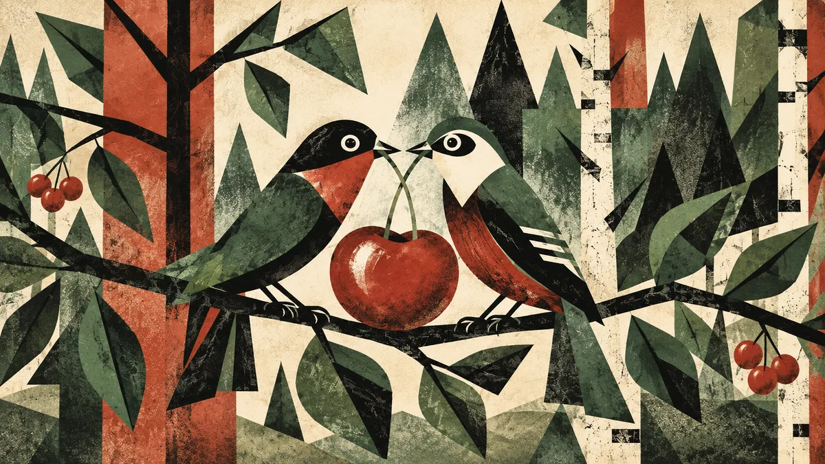
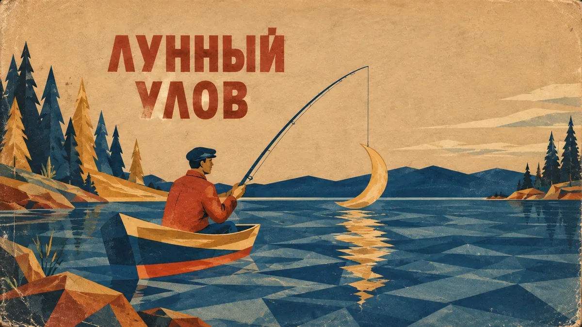
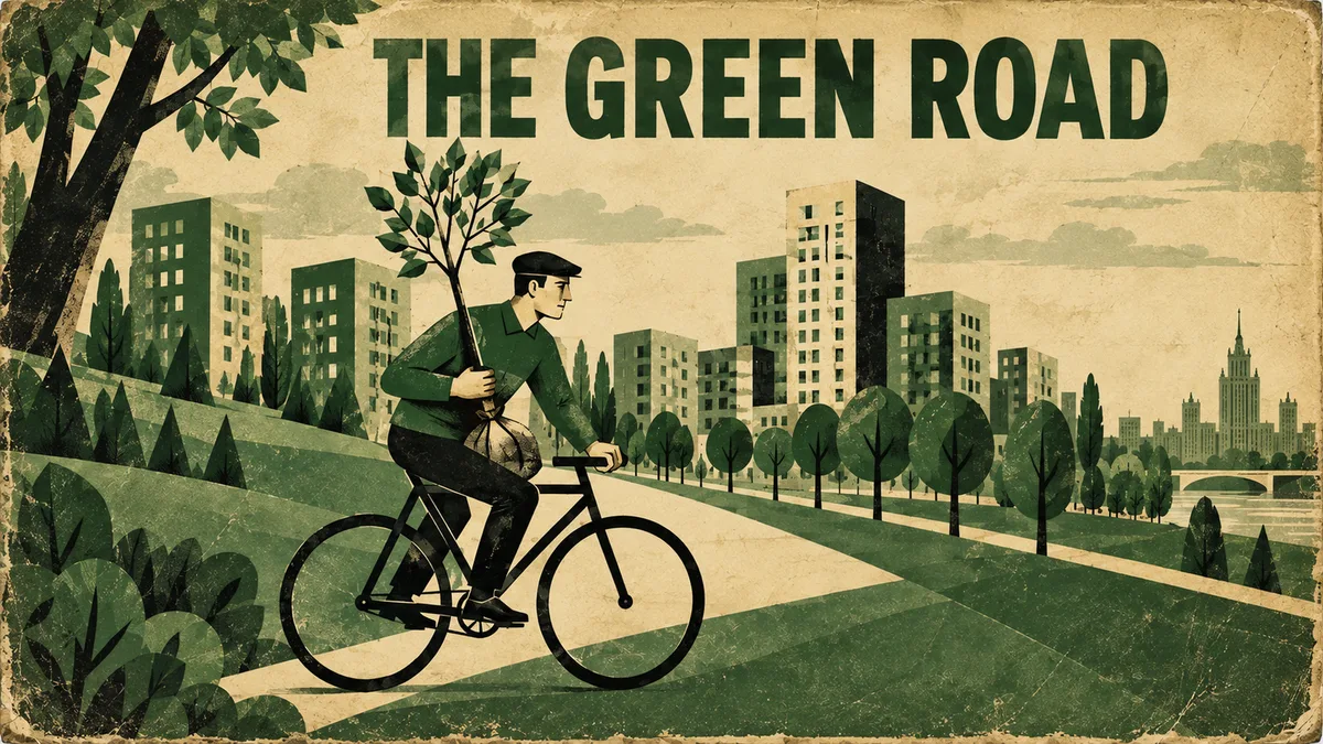
Лаконичная восточноевропейская книжная графика середины XX века с плоской метафорой и ограниченной печатной палитрой. Простые фигуры, грубая бумага и лёгкое смещение красок создают убедительное ощущение старого издания. Подходит для обложек, афиш и общественно-просветительских сюжетов.
Промпт
Create a [FORMAT] mid-century Eastern European book-cover or public-information illustration about [SUBJECT]. Reduce the idea to one clear visual metaphor made from flat geometric shapes, simplified human or animal figures and a few hand-drawn lines. Use an economical 2–4 ink palette chosen from muted brick red, forest green, dusty blue, ochre, black and yellowed paper. Apply coarse lithographic or letterpress texture, visible paper fibers, uneven ink density, slightly misregistered colors and softened worn corners. The composition should be frontal, compact and ingenious, with asymmetric folk-modernist balance and abundant unprinted paper. Optional exact title: ""[TEXT]"" in bold condensed grotesk or simple hand-set type, aligned along an edge or integrated into the illustration. It should feel authentically printed between the 1950s and 1970s, modest and clever rather than propagandistic.
Avoid: modern vector perfection, Stalinist monumental realism, excessive Soviet symbols, glossy nostalgia poster, elaborate gradients, photorealism, fake dense Cyrillic text, watermark.
Как использовать
1. Укажите тему или метафору в [SUBJECT].
2. Выберите 2–4 краски из предложенной палитры.
3. При необходимости вставьте короткое точное название в [TEXT].
4. Проверьте, чтобы результат сохранял книжную простоту и не уходил в монументальную пропаганду или глянцевую ретро-стилизацию.
Похожие приёмы
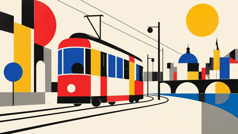
Bauhaus
Баухаус
Translate the subject into a disciplined Bauhaus-inspired composition. Reduce it to fundamental geometric elements—circles, rectangles, semicircles, straight lines, and carefully measured overlaps—on an ivory or warm-white field. Use a strict but playful primary-color palette of red, cobalt blue, mustard yellow, black, and a small gray neutral. Establish clear alignment, purposeful asymmetry, and dynamic balance through scale and placement rather than decoration. If the subject is figurative, abstract its defining features into a few geometric relationships while retaining recognition; if it i
Brutalism
Брутализм
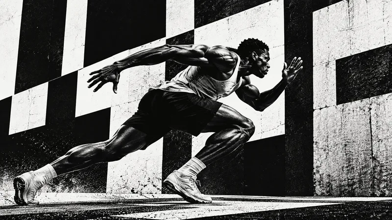
Design the subject as a confrontational brutalist poster. Use an uncompromising black-and-white palette, huge heavy sans-serif typography when exact text is supplied, raw high-contrast photo cutouts, coarse halftone or xerox grain, and strong rectangular blocks. Crop boldly, let elements run toward or beyond the frame edges, and embrace deliberate visual weight without decorative polish. One dominant subject or phrase should be immediately legible across a wide 16:9 canvas, supported by smaller restrained details. Use rough print imperfections and hard light to intensify the mood. The result s

Anti-design
Антидизайн
Treat the subject as an intentional anti-design experiment. Reject a neat corporate grid: mix drastically different crop sizes, clashing type scales, abrasive color combinations, abrupt borders, overlapping photo fragments, raw screenshots or print textures, and visual collisions that feel audacious but authored. Use a high-impact palette such as black, red, lime, pink, cobalt, and off-white. Arrange several panels or zones across the 16:9 canvas so the viewer notices dissonance, yet guide attention back to one primary subject or message. If text is required, use only a few exact short words a