One-Bit Dither
Однобитный дизеринг
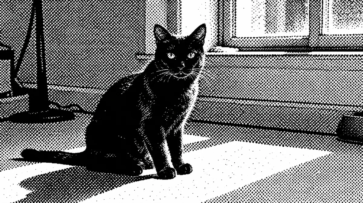
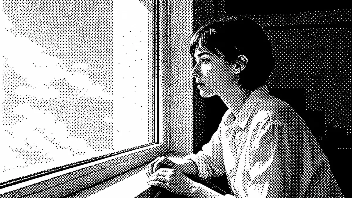
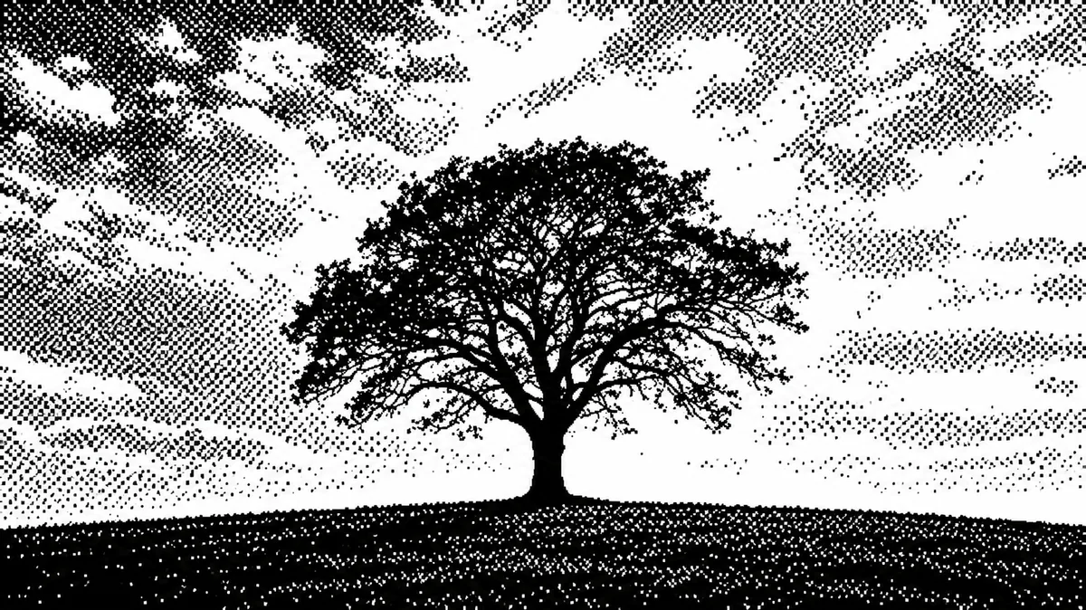
Фотография преобразуется в изображение из двух цветов — чистого чёрного и белого. Полутона передаются регулярным узором одинаковых пикселей; крупные светлые и тёмные области остаются выразительными.
Промпт
Rebuild the uploaded image as a one bit image: pure black and pure white pixels only, with every tone resolved by a dither pattern.

THE CORE CONCEPT, read this first:
One bit means TWO colours. Every pixel is either full black or full white, and there is not a single grey pixel in the whole image. All shading, gradients and soft light are replaced by patterns of black and white pixels sitting next to each other, so that from a distance the eye averages them into tone. Every dot is the SAME SIZE, one cell of the grid, placed on a regular grid. This is not a halftone where dots grow and shrink, not a stipple drawing, not a threshold silhouette with no midtones, not a grey photo with noise on it, and not a newspaper print.

THE DITHER:
An ordered dither at a coarse visible pitch, dot cells of 2 to 4 pixels, so the pattern reads as a texture and not as fine noise. In even mid tones the pattern settles into a regular checkerboard, crosshatch or diagonal weave; across transitions it steps through visibly different densities in distinct bands rather than a smooth ramp. In the light areas the black dots thin out into sparse isolated pixels on white; in the dark areas the white dots thin out into sparse isolated pixels on black. Large flat areas such as skies, walls or shadows become an even field of the same pattern.

THE TONES:
Contrast is pushed hard before dithering: the darkest 25 percent of the original goes to solid black, the lightest 15 percent goes to solid white, and only the middle is dithered. The picture must have real solid black masses and real clean white masses, not an even grey field of dots. Hard edges in the original stay hard: the boundary between a dark shape and a light one is a crisp stepped line of solid black meeting solid white, never a gradual dither ramp.

WHAT SURVIVES:
Keep the original composition, framing, crop, subject and pose exactly. The subject must stay clearly readable from the dot pattern alone: faces recognisable, silhouettes crisp, the main shapes reading at a glance.

NEGATIVE CONSTRAINTS:
No grey pixels anywhere, not one. No smooth gradients, no anti aliasing, no soft edges, no blur. No dots of varying size, no halftone rosette, no newspaper screen, no stipple. No colour of any kind, not even a tint on the white or on the black. No paper texture, no ink bleed, no scan artefacts. No scanlines, no CRT curvature, no glitch. No frame, no border, no window, no drop shadow, no device mockup. No text, no logos, no watermark. Do not change the crop.

The final result must look like a photograph shown on an early computer screen that can only display black and white pixels.
Как использовать
Загрузите фото с простым силуэтом и заметным светотеневым контрастом. Примените промпт.
Если появились серые пиксели или точки разных размеров, используйте команду исправления.
Only fix the tones: remove every grey pixel and rebuild those areas with black and white dots of exactly the same size on the same grid, pushing the darkest areas to solid black and the lightest to solid white. Keep the composition and the crop identical.
---
Похожие приёмы
Bauhaus
Баухаус
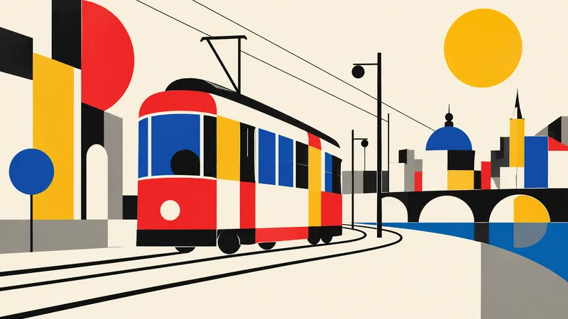
Translate the subject into a disciplined Bauhaus-inspired composition. Reduce it to fundamental geometric elements—circles, rectangles, semicircles, straight lines, and carefully measured overlaps—on an ivory or warm-white field. Use a strict but playful primary-color palette of red, cobalt blue, mustard yellow, black, and a small gray neutral. Establish clear alignment, purposeful asymmetry, and dynamic balance through scale and placement rather than decoration. If the subject is figurative, abstract its defining features into a few geometric relationships while retaining recognition; if it i
Brutalism
Брутализм
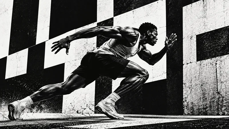
Design the subject as a confrontational brutalist poster. Use an uncompromising black-and-white palette, huge heavy sans-serif typography when exact text is supplied, raw high-contrast photo cutouts, coarse halftone or xerox grain, and strong rectangular blocks. Crop boldly, let elements run toward or beyond the frame edges, and embrace deliberate visual weight without decorative polish. One dominant subject or phrase should be immediately legible across a wide 16:9 canvas, supported by smaller restrained details. Use rough print imperfections and hard light to intensify the mood. The result s
Anti-design
Антидизайн
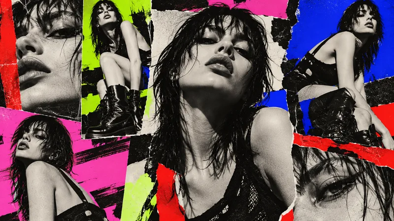
Treat the subject as an intentional anti-design experiment. Reject a neat corporate grid: mix drastically different crop sizes, clashing type scales, abrasive color combinations, abrupt borders, overlapping photo fragments, raw screenshots or print textures, and visual collisions that feel audacious but authored. Use a high-impact palette such as black, red, lime, pink, cobalt, and off-white. Arrange several panels or zones across the 16:9 canvas so the viewer notices dissonance, yet guide attention back to one primary subject or message. If text is required, use only a few exact short words a