Glass Morphism
Глассморфизм
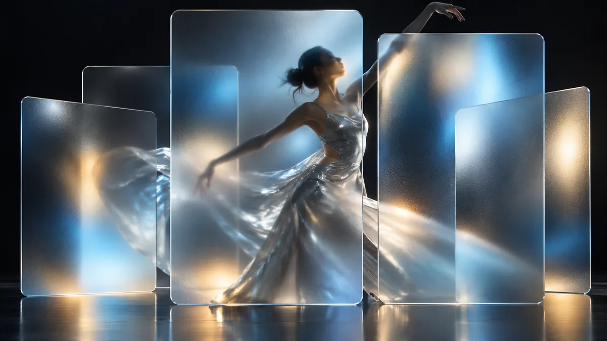
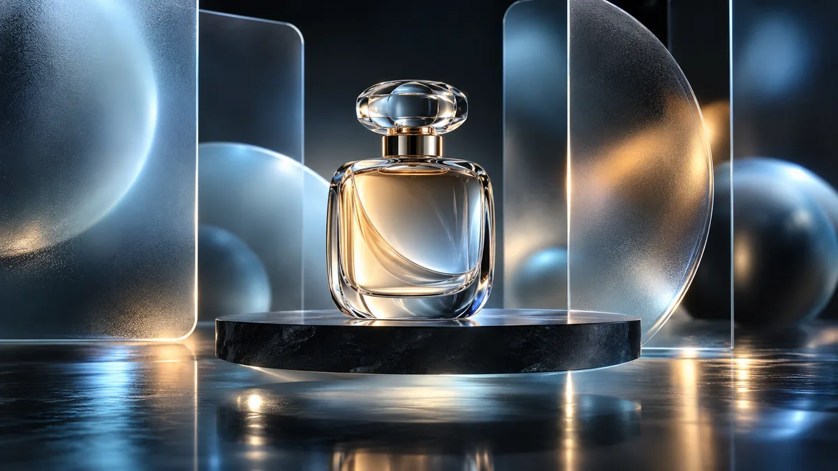
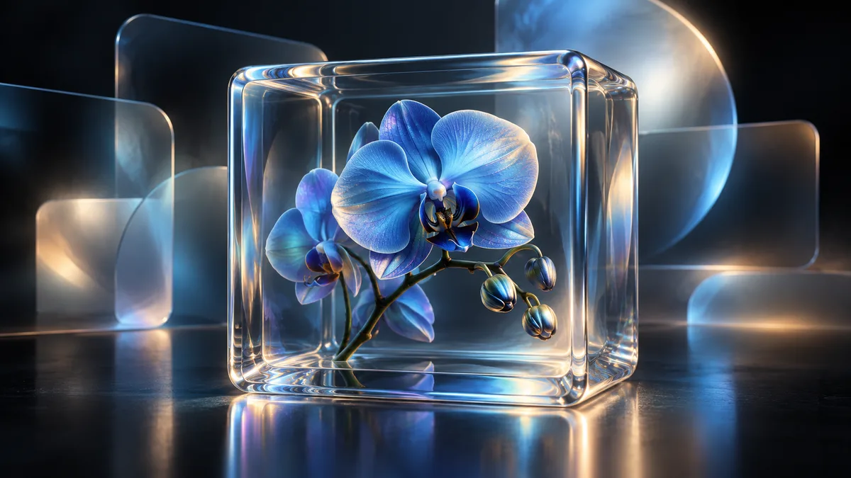
Тёмная цифровая композиция с полупрозрачными матовыми панелями, мягким преломлением света и размытыми цветными ореолами. Выглядит как премиальная визуальная кампания.
Промпт
Present the subject within a premium glassmorphism composition. Use a nearly black or deep-charcoal background, one or two large translucent frosted-glass panels with softly rounded corners, a delicate light border, realistic refraction, and subtle layered depth. Behind the glass, add defocused luminous gradients or abstract light halos in cool blue, silver, pale cyan, and restrained warm amber. Keep the subject as the clear hero, visible through or in front of the glass without being swallowed by blur. Use generous spacing, quiet asymmetry, soft highlights, and clean contemporary typography only if requested. The effect should feel like a refined digital brand campaign or elegant interface visual, not an overloaded dashboard.
Как использовать
Опишите нужного героя, предмет или сцену и добавьте английский промпт стиля в конец запроса. Если используете исходное фото, попросите сохранить личность, позу и важные детали. Для текста задайте короткую точную надпись; если текст не нужен, запретите буквы, цифры и логотипы.
Похожие приёмы
Bauhaus
Баухаус
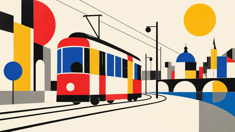
Translate the subject into a disciplined Bauhaus-inspired composition. Reduce it to fundamental geometric elements—circles, rectangles, semicircles, straight lines, and carefully measured overlaps—on an ivory or warm-white field. Use a strict but playful primary-color palette of red, cobalt blue, mustard yellow, black, and a small gray neutral. Establish clear alignment, purposeful asymmetry, and dynamic balance through scale and placement rather than decoration. If the subject is figurative, abstract its defining features into a few geometric relationships while retaining recognition; if it i
Brutalism
Брутализм
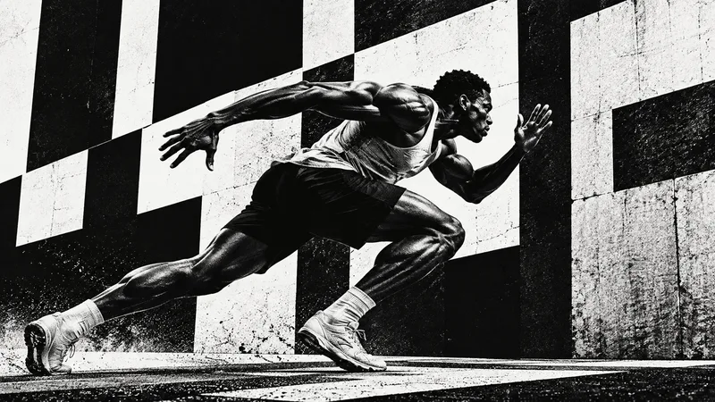
Design the subject as a confrontational brutalist poster. Use an uncompromising black-and-white palette, huge heavy sans-serif typography when exact text is supplied, raw high-contrast photo cutouts, coarse halftone or xerox grain, and strong rectangular blocks. Crop boldly, let elements run toward or beyond the frame edges, and embrace deliberate visual weight without decorative polish. One dominant subject or phrase should be immediately legible across a wide 16:9 canvas, supported by smaller restrained details. Use rough print imperfections and hard light to intensify the mood. The result s
Anti-design
Антидизайн
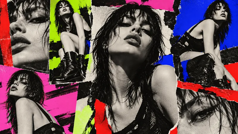
Treat the subject as an intentional anti-design experiment. Reject a neat corporate grid: mix drastically different crop sizes, clashing type scales, abrasive color combinations, abrupt borders, overlapping photo fragments, raw screenshots or print textures, and visual collisions that feel audacious but authored. Use a high-impact palette such as black, red, lime, pink, cobalt, and off-white. Arrange several panels or zones across the 16:9 canvas so the viewer notices dissonance, yet guide attention back to one primary subject or message. If text is required, use only a few exact short words a