Blob Tracking
Трекинг объектов
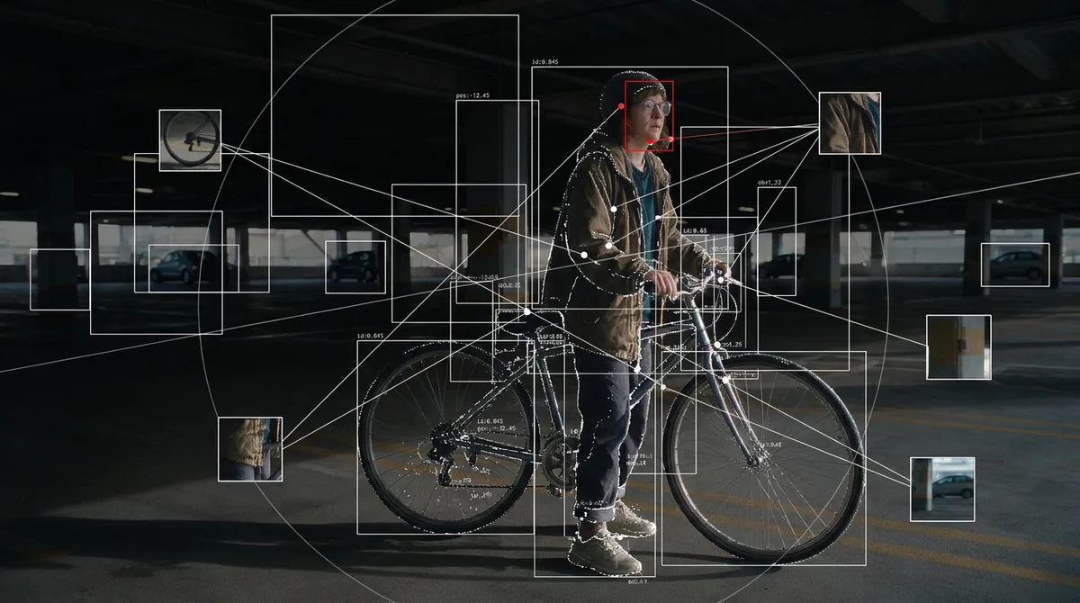
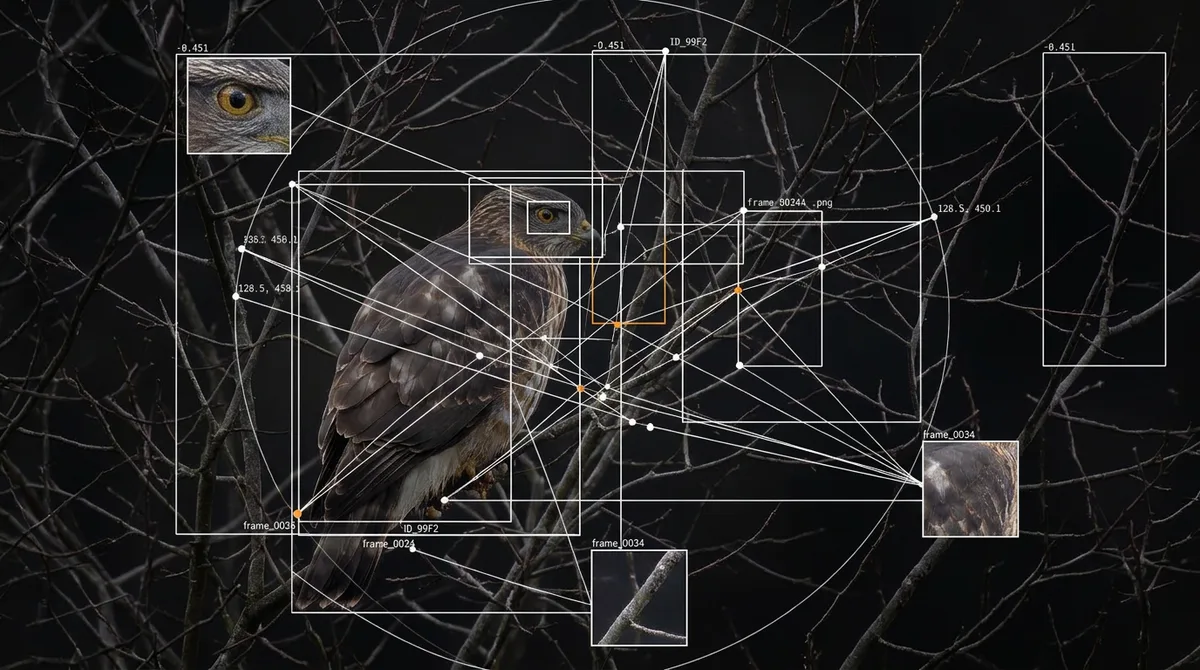
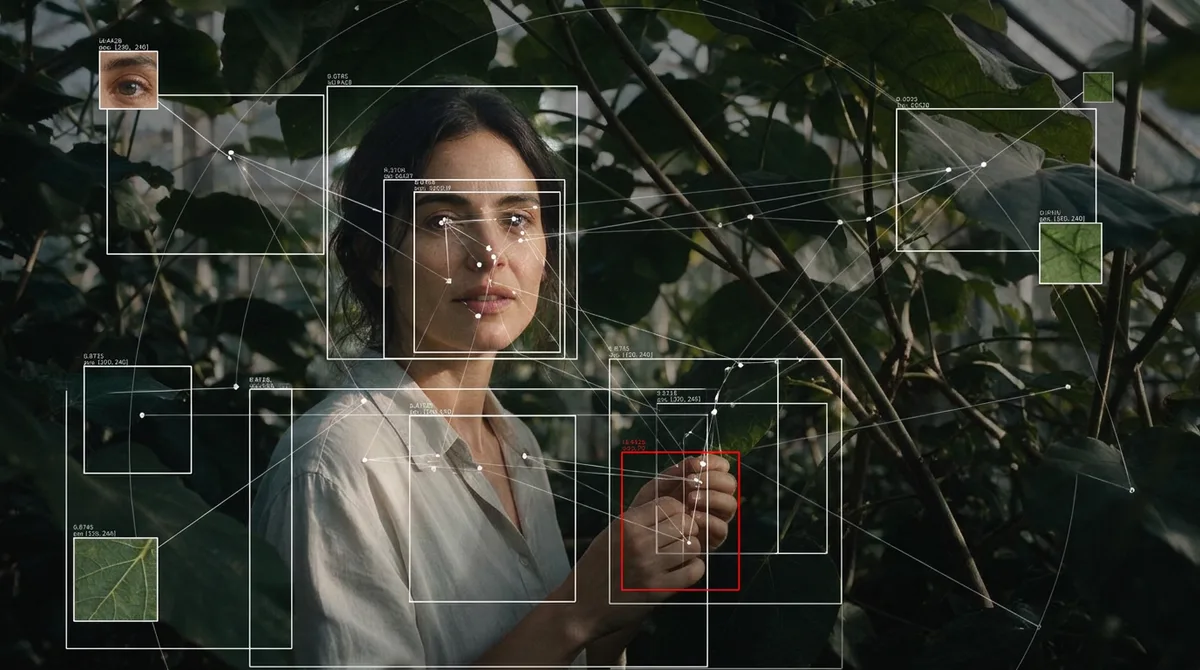
Фото выглядит как снимок из системы компьютерного зрения: поверх узнаваемого объекта нанесены тонкие рамки обнаружения, точки, связи и мелкие машинные метки. Неровная, местами ошибочная разметка создаёт ощущение рабочего анализа кадра.
Промпт
"Rebuild the uploaded image as a frame captured from a computer vision system that is analysing it: a tracker drawing its detections, its measurements and its guesses directly over the picture.

THE CORE CONCEPT, read this first:
A machine is looking at this picture and annotating what it thinks it has found: thin boxes, node points, connecting lines and tiny numeric labels. The subject stays photographic underneath and the annotation is drawn on top as flat, hairline vector graphics with no depth. The detections must be IMPERFECT: a real tracker boxes things that do not matter, misses obvious things, boxes the same object two or three times with slightly offset rectangles, and connects points that have no logical relation. This is not an infographic, not a poster with a tidy diagram, not a film HUD, not a game interface, and nothing on it is designed to be read by a human.

THE UNDERLAY:
The original picture, with the main subject kept bright, sharp and recognisable, while the surroundings are pushed down toward near black (about 70 to 85 percent darker than the original) and drained of most of their colour, so the graphics are the brightest thing in the frame. Where the subject has fine structure (edges, veins, feathers, hair, branches, folds), part of it may be retraced as thin white contour lines or as a sparse cloud of white points, like a scan.

THE GRAPHICS, all hairline, 1 pixel wide, white:
Between 15 and 40 rectangular detection boxes of very different sizes, from 10 pixels wide to a third of the frame: some tight on real features, some far too large, some overlapping, some sitting on empty background. Corners are square, and some boxes are drawn as open corner brackets only.
Between 20 and 60 small node points, 2 to 3 pixels each, joined by straight lines into an irregular network that spans the whole frame, including the empty areas. Lines cross each other freely.
Three to eight tiny square crops of parts of the picture, 40 to 90 pixels wide, pasted elsewhere in the frame with a thin white border and a leader line back to the place they were cut from.
One or two faint large circles or arcs crossing the frame, and a few long alignment lines that run all the way to the frame edge.

THE LABELS:
Tiny monospace text, 5 to 8 pixels tall, deliberately hard to read. Labels are DATA only: decimal numbers with 3 to 6 digits, negative values, coordinate pairs, short filenames with extensions such as .png or .jpeg, tokens like id, obj or frame, and hex codes. Twenty to fifty labels scattered next to nodes and boxes, a few of them clipped by the frame edge. Nothing in plain language and no word that describes the subject.

THE PALETTE:
Near black ground, white graphics, white labels. Exactly one accent colour, a small red or orange, used on no more than three elements (a filled box, a highlighted node, a single line). No other colour in the graphics.

WHAT SURVIVES:
Keep the original composition, framing, crop, subject and pose exactly. The subject remains fully recognisable as a photograph under the annotation, and the boxes and nodes follow the real shapes in the picture even when they pick the wrong ones.

NEGATIVE CONSTRAINTS:
No thick lines, no rounded corners, no glow, no drop shadows, no gradients on the graphics. No legible sentences, headings, titles, captions, brand names or explanations. No neon cyan sci fi interface, no radar, no circular gauges, no percentage bars, no screen bezel. No 3D and no perspective on the graphics, everything sits flat on the picture plane. No bright saturated background, it must be darkened. No second accent colour. No readable text, no logos, no watermark. Do not change the crop.

The final result must look like a raw screenshot exported from a machine vision tool halfway through a job, not like a designed poster about one."
Как использовать
Загрузите фото с хорошо различимыми деталями: лицом, листьями, ветками или предметами. Примените промпт редактирования.
При слишком аккуратной разметке используйте команду исправления.
Only fix the annotation: make the detection boxes inconsistent (some far too large, some overlapping, some on empty background, a few obvious things left undetected), reduce every line to 1 pixel white with no glow, and replace any readable word with numbers or filenames. Keep the photograph, the composition and the crop identical.
Похожие приёмы
Bauhaus
Баухаус
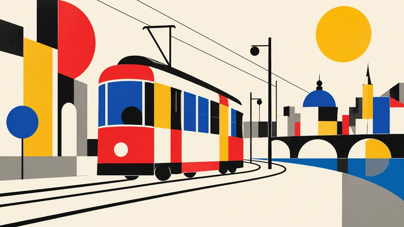
Translate the subject into a disciplined Bauhaus-inspired composition. Reduce it to fundamental geometric elements—circles, rectangles, semicircles, straight lines, and carefully measured overlaps—on an ivory or warm-white field. Use a strict but playful primary-color palette of red, cobalt blue, mustard yellow, black, and a small gray neutral. Establish clear alignment, purposeful asymmetry, and dynamic balance through scale and placement rather than decoration. If the subject is figurative, abstract its defining features into a few geometric relationships while retaining recognition; if it i
Brutalism
Брутализм
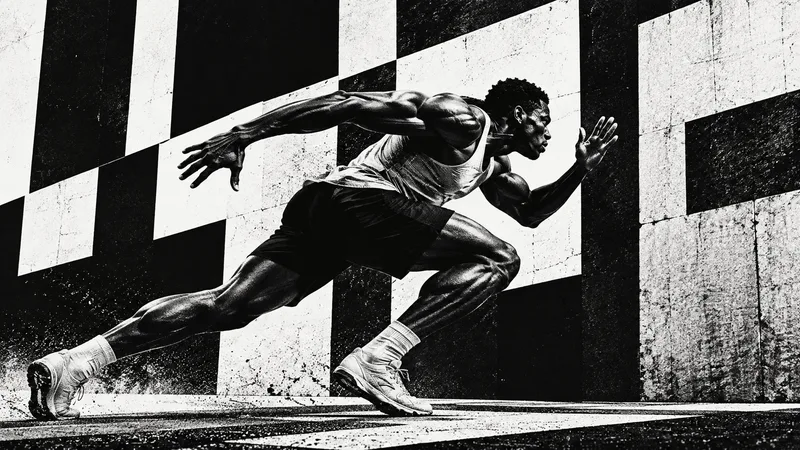
Design the subject as a confrontational brutalist poster. Use an uncompromising black-and-white palette, huge heavy sans-serif typography when exact text is supplied, raw high-contrast photo cutouts, coarse halftone or xerox grain, and strong rectangular blocks. Crop boldly, let elements run toward or beyond the frame edges, and embrace deliberate visual weight without decorative polish. One dominant subject or phrase should be immediately legible across a wide 16:9 canvas, supported by smaller restrained details. Use rough print imperfections and hard light to intensify the mood. The result s
Anti-design
Антидизайн
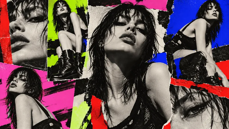
Treat the subject as an intentional anti-design experiment. Reject a neat corporate grid: mix drastically different crop sizes, clashing type scales, abrasive color combinations, abrupt borders, overlapping photo fragments, raw screenshots or print textures, and visual collisions that feel audacious but authored. Use a high-impact palette such as black, red, lime, pink, cobalt, and off-white. Arrange several panels or zones across the 16:9 canvas so the viewer notices dissonance, yet guide attention back to one primary subject or message. If text is required, use only a few exact short words a